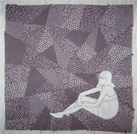
Not only have I formed a callus on my thumb from all the quilting these pieces have involved, I have formed a crater within said callus from the repetitive prodding of the needle eye. Ah, craft, such an elegant occupation!
Friday, January 15, 2010
A peek for you
A peek at the first of the completed trio, and a statement about the making of them:

Not only have I formed a callus on my thumb from all the quilting these pieces have involved, I have formed a crater within said callus from the repetitive prodding of the needle eye. Ah, craft, such an elegant occupation!
Friday, December 18, 2009
Trio update
All three pieced tops are now embroidered, and ready for quilting. See?

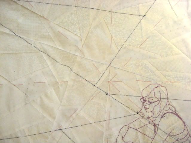
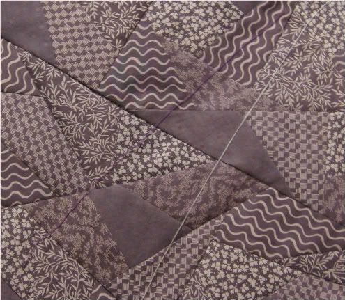
But before quilting must come basting. I always sigh at basting; I'd rather get right to work. It really is necessary for this sort of thing, though. Plus, when you need to draw a line that is sure to leave no mark as soon as you're done with it, nothing beats a thin piece of thread.

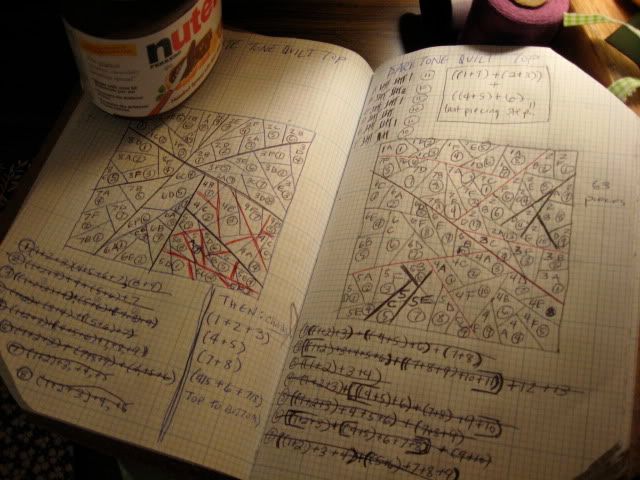
While I'm showing you pictures, take a peek at these pages from my work book (sketch book? idea book?). This is the basic planning I began with, the careful plotting out of the pieced tops. Pre-planning is helpful.
But before quilting must come basting. I always sigh at basting; I'd rather get right to work. It really is necessary for this sort of thing, though. Plus, when you need to draw a line that is sure to leave no mark as soon as you're done with it, nothing beats a thin piece of thread.
While I'm showing you pictures, take a peek at these pages from my work book (sketch book? idea book?). This is the basic planning I began with, the careful plotting out of the pieced tops. Pre-planning is helpful.
Friday, December 11, 2009
Mid-December quilting
I've been hoping for a nice, clear skied afternoon on which to photograph the recently completed doodle piece (otherwise yet unnamed) but alas, it is southern California's brief rainy season, and photography-friendly conditions have been elusive. So until that changes, check out something about the piece that I am enjoying:

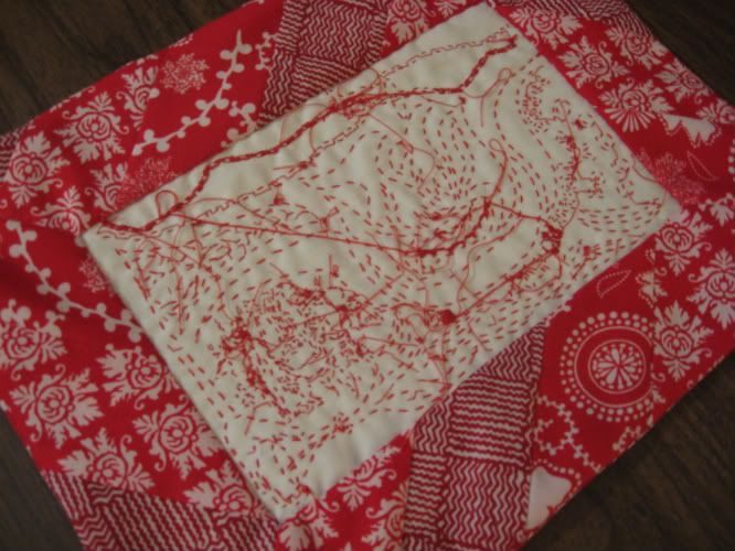
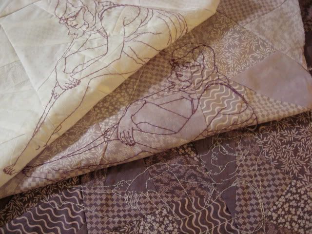
This is the back of the piece. It is as carefully bordered and presented as the front is.
I've always been intrigued by the backs of embroideries, the unexpected imagery that develops through the path of the stitcher's hand, the contrast between the intended image and the secret, hidden one. I'm often tempted to display work backwards, but always choose not to- I don't want to sacrifice the intended imagery for the unintended.
This time I decided to give both sides their due, so that the piece can be displayed as a finished work from either direction. Front and back have differently pieced borders in the same fabrics, related but different, just as the front and back of the image is.
It's an experiment, one I'm rather enjoying right now. I think it's fitting, as well- after all, the entire thing is an experiment.
In other news, here's something fun:

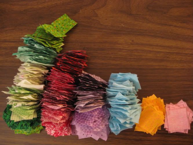
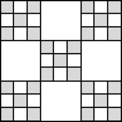
These are the first 1,000 pieces of what will eventually be a 3,969 piece quilt top. I've been wanting to tackle a full-sized quilt for some time now, but was putting it off because I simply didn't have fabrics I wanted to work with in the quantity needed for a really well-matched quilt. My hands and mind have been anxious for this sort of project, though- something long term, something full of order and repetition, something soothing- so I decided to go for it anyway. I picked a double nine patch pattern (like the one below) and plan to break up the intended large-scale pattern to create my own variation.

The neat part about this design, for me, is how it doesn't require (at least for about 54% of it) carefully matched fabrics. In the tradition of truly purposeful patchwork, the double nine patch gives me the chance to go through my stores of fabric, picking out even the smallest bits and finding use for them. If I can squeeze even one 1 1/2" square out of a scrap, it is useful.
Of course, by now I've gone through all of my basic pattered cottons, and have barely a quarter of the squares I need! That's another nice thing about this project, though- it lends itself to mismatching, so if some parts are composed of the materials I have now and others from scraps of future projects, that's ok. It's nicely frugal. It makes me happy.
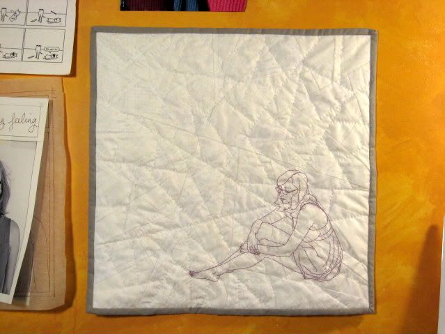
This is the back of the piece. It is as carefully bordered and presented as the front is.
I've always been intrigued by the backs of embroideries, the unexpected imagery that develops through the path of the stitcher's hand, the contrast between the intended image and the secret, hidden one. I'm often tempted to display work backwards, but always choose not to- I don't want to sacrifice the intended imagery for the unintended.
This time I decided to give both sides their due, so that the piece can be displayed as a finished work from either direction. Front and back have differently pieced borders in the same fabrics, related but different, just as the front and back of the image is.
It's an experiment, one I'm rather enjoying right now. I think it's fitting, as well- after all, the entire thing is an experiment.
In other news, here's something fun:
These are the first 1,000 pieces of what will eventually be a 3,969 piece quilt top. I've been wanting to tackle a full-sized quilt for some time now, but was putting it off because I simply didn't have fabrics I wanted to work with in the quantity needed for a really well-matched quilt. My hands and mind have been anxious for this sort of project, though- something long term, something full of order and repetition, something soothing- so I decided to go for it anyway. I picked a double nine patch pattern (like the one below) and plan to break up the intended large-scale pattern to create my own variation.
The neat part about this design, for me, is how it doesn't require (at least for about 54% of it) carefully matched fabrics. In the tradition of truly purposeful patchwork, the double nine patch gives me the chance to go through my stores of fabric, picking out even the smallest bits and finding use for them. If I can squeeze even one 1 1/2" square out of a scrap, it is useful.
Of course, by now I've gone through all of my basic pattered cottons, and have barely a quarter of the squares I need! That's another nice thing about this project, though- it lends itself to mismatching, so if some parts are composed of the materials I have now and others from scraps of future projects, that's ok. It's nicely frugal. It makes me happy.
Labels:
embroidery,
plans,
progress shots,
quilting
Tuesday, December 1, 2009
Takashi Iwasaki
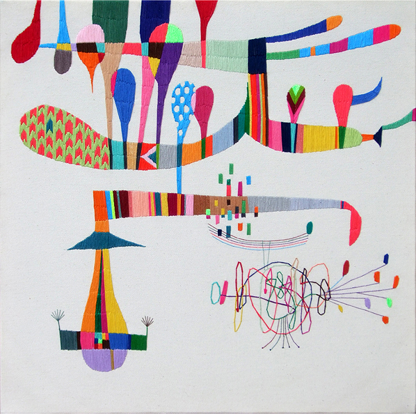
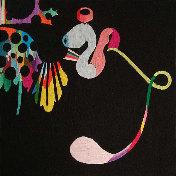
While I work on the final stitches of the doodle piece, take a look at this artist:
Nyokinyokinijiirokousen
Embroidery floss and canvas (hand embroidered)
40.5 x 40.5cm
2008
Sakuretsupipe
Embroidery floss and fabric (hand embroidered)
30.5cm x 30.5cm
2008
Fishbonbon
Embroidery floss and fabric (hand embroidered)
28.5cm x 28.5cm
2008
The artist I am referring to is Takashi Iwasaki. Iwasaki's work is not limited to embroidery; on his site you can see many interesting paintings, drawings, prints and collages. For now, though, I want to give attention to his embroideries.
In a way, Iwasaki's work and my own have some similarities. We share a medium, and a concern for shape and space. However, it is the differences that really capture my attention. My work tends to be quiet- his sings out at high volume. Iwasaki's embroideries focus on color, pattern, shape, line, and space in a bright, bold way. Rather than drawing a clear narrative with his threads, he uses his shapes and colors to suggest images, playing with your eyes in a delightful way. It's exciting to see how the the same broad medium I work in can be used to such a striking and different effect.
But! I ought to be stitching. Go check out his site- it's really worthwhile.
Embroidery floss and canvas (hand embroidered)
40.5 x 40.5cm
2008
Embroidery floss and fabric (hand embroidered)
30.5cm x 30.5cm
2008
Embroidery floss and fabric (hand embroidered)
28.5cm x 28.5cm
2008
The artist I am referring to is Takashi Iwasaki. Iwasaki's work is not limited to embroidery; on his site you can see many interesting paintings, drawings, prints and collages. For now, though, I want to give attention to his embroideries.
In a way, Iwasaki's work and my own have some similarities. We share a medium, and a concern for shape and space. However, it is the differences that really capture my attention. My work tends to be quiet- his sings out at high volume. Iwasaki's embroideries focus on color, pattern, shape, line, and space in a bright, bold way. Rather than drawing a clear narrative with his threads, he uses his shapes and colors to suggest images, playing with your eyes in a delightful way. It's exciting to see how the the same broad medium I work in can be used to such a striking and different effect.
But! I ought to be stitching. Go check out his site- it's really worthwhile.
Saturday, November 14, 2009
Press, prints and patterns
Some brief updates:
The show I worked on a few weeks ago has been getting some press at FresnoBeehive.com, and the set has gotten some mention. Quotes:
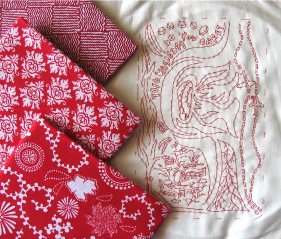
In other news! I selected some prints with which to piece a border for my doodle embroidery:

Reds and whites with interesting shapes and linework, to echo and compliment the doodlework.
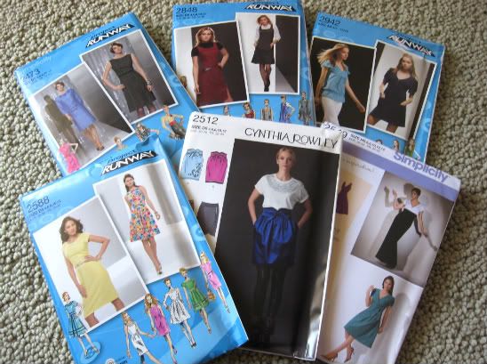
While looking for those prints, I stumbled upon a Veterans Day pattern sale where I snagged 100$ worth of patterns for a mere 6$. I rarely buy patterns, figuring that I know how to drape and draft and can make them myself- but at only a buck a piece, I couldn't pass up the time saver. I chose all patterns that I thought could not only give me an interesting garment or two on their own, but could then be altered in many ways, limited only by my imagination. I think I might play with the skirt first.

Something I find both fun and amusing about those Project Runway patterns: in each one is a "Croquis Kit." The Kit is a piece of paper intended to help one branch out from the basic pattern. It illustrates the pattern elements (bodice, skirt, sleeves, yoke, details, etc) one by one with all their offered variables, and encourages the stitcher to mix and match them in the manner of Fashion Plates to create their own, more unique design. Paired with the illustrations are quite a few example designs and instructive paragraphs with titles such as "A Word About Inspiration," "Workroom Tips," and "Design Tips." All of this makes me laugh at first, because after having done this sort of thing on my own for so many years, it seems so obvious- but then, I suppose, it's really actually pretty cool. How often do you buy a pattern that, instead of encouraging you to buy another pattern, encourages you to get creative and experiment with just one to create as many different garments as you can? Project Runway, I approve.
The show I worked on a few weeks ago has been getting some press at FresnoBeehive.com, and the set has gotten some mention. Quotes:
"There are many aspects of this version of "All in the Timing" that are effective, from Jeff White and Chris Campbell's inspired set design (distinguished by Katharine Lawrie's artwork) to the sight of the very amusing Red blundering around stage with a mountain climber's axe buried in his skull."I must say, it's kinda fun to see myself referred to in print as a "Los Angeles artist."
"Tell us about the set. I understand it's pretty wild."
"The set, designed by Jeff White, built by the cast and crew and painted by Los Angeles artist Katharine Lawrie, has four separate playing spaces to allow quick shifts between the plays and help provide a variety of looks. The set theme is a fanciful play on the title and all the vertical surfaces are covered with 344 unique 'clocks.'"
In other news! I selected some prints with which to piece a border for my doodle embroidery:
Reds and whites with interesting shapes and linework, to echo and compliment the doodlework.
While looking for those prints, I stumbled upon a Veterans Day pattern sale where I snagged 100$ worth of patterns for a mere 6$. I rarely buy patterns, figuring that I know how to drape and draft and can make them myself- but at only a buck a piece, I couldn't pass up the time saver. I chose all patterns that I thought could not only give me an interesting garment or two on their own, but could then be altered in many ways, limited only by my imagination. I think I might play with the skirt first.
Something I find both fun and amusing about those Project Runway patterns: in each one is a "Croquis Kit." The Kit is a piece of paper intended to help one branch out from the basic pattern. It illustrates the pattern elements (bodice, skirt, sleeves, yoke, details, etc) one by one with all their offered variables, and encourages the stitcher to mix and match them in the manner of Fashion Plates to create their own, more unique design. Paired with the illustrations are quite a few example designs and instructive paragraphs with titles such as "A Word About Inspiration," "Workroom Tips," and "Design Tips." All of this makes me laugh at first, because after having done this sort of thing on my own for so many years, it seems so obvious- but then, I suppose, it's really actually pretty cool. How often do you buy a pattern that, instead of encouraging you to buy another pattern, encourages you to get creative and experiment with just one to create as many different garments as you can? Project Runway, I approve.
Tuesday, November 10, 2009
A thread color debate
Choice 2 won out!

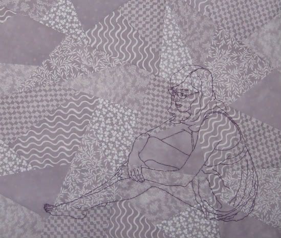
Before I made a single stitch, I planned out which threads to use with which piece. The white piece would get a pale lavender, the pale lavender a darker purple (as seen above!) and the darker purple a white thread. This was my plan.
Now that I have begun, though, as it always goes, I am questioning my plan. Should I do as I planned, and use white thread to embroider the darkest piece? Or should I use the darker purple thread of the mid tone piece on all 3 pieces?

Or do I wait until Thursday afternoon, when I planned on going out for some quilting supplies anyway, and pick up a drastically darker purple thread, dark enough to stand out from the dark purple background? Each option comes with different implications.
The same color thread on all 3 pieces will ensure that the character is affected differently by the pattern in each piece. As the fabric grows darker and the patterns more apparent, the character will grow more overwhelmed- which is a good thing, congruent with the concept. However! Will the character be so overwhelmed on the darkest piece as to be hardly noticeable? Would I be ok with that, if it is the case? Conceptually, this is my strongest option- but is it the strongest visual one? *EDIT- This option isn't an option. While it is my favorite one, the thread I have already used on the mid tone piece just isn't visible on the dark piece. As much as it supports the concept, well, it supports it a little too strongly. I want the character to be overwhelmed by the patterns, not made invisible by them. Oh well.*
Using white on the darkest piece echoes the connective cycle I have planned for the final quilting- each piece receiving a treatment reminiscent of the piece prior. It connects 1 (the lightest) to 2 (the mid tone), 2 to 3 (the dark tone), and 3 to 1. This was my original plan, and remains my quilting plan. Conceptually, not as strong, but stronger than the next choice. Visually more apparent than the former choice, but will it be more apparent than the next?
Using a very dark purple on the darkest piece connects the 3 pieces in a different way, by applying a tonally darker thread to each piece. I feel that this is the weakest connection- but it could be the most visually pleasing.
I'm currently stuck. Opinions welcome!
Before I made a single stitch, I planned out which threads to use with which piece. The white piece would get a pale lavender, the pale lavender a darker purple (as seen above!) and the darker purple a white thread. This was my plan.
Now that I have begun, though, as it always goes, I am questioning my plan. Should I do as I planned, and use white thread to embroider the darkest piece? Or should I use the darker purple thread of the mid tone piece on all 3 pieces?
Or do I wait until Thursday afternoon, when I planned on going out for some quilting supplies anyway, and pick up a drastically darker purple thread, dark enough to stand out from the dark purple background? Each option comes with different implications.
The same color thread on all 3 pieces will ensure that the character is affected differently by the pattern in each piece. As the fabric grows darker and the patterns more apparent, the character will grow more overwhelmed- which is a good thing, congruent with the concept. However! Will the character be so overwhelmed on the darkest piece as to be hardly noticeable? Would I be ok with that, if it is the case? Conceptually, this is my strongest option- but is it the strongest visual one? *EDIT- This option isn't an option. While it is my favorite one, the thread I have already used on the mid tone piece just isn't visible on the dark piece. As much as it supports the concept, well, it supports it a little too strongly. I want the character to be overwhelmed by the patterns, not made invisible by them. Oh well.*
Using white on the darkest piece echoes the connective cycle I have planned for the final quilting- each piece receiving a treatment reminiscent of the piece prior. It connects 1 (the lightest) to 2 (the mid tone), 2 to 3 (the dark tone), and 3 to 1. This was my original plan, and remains my quilting plan. Conceptually, not as strong, but stronger than the next choice. Visually more apparent than the former choice, but will it be more apparent than the next?
Using a very dark purple on the darkest piece connects the 3 pieces in a different way, by applying a tonally darker thread to each piece. I feel that this is the weakest connection- but it could be the most visually pleasing.
I'm currently stuck. Opinions welcome!
Labels:
feedback welcome,
option debate,
plans,
progress shots
Friday, November 6, 2009
Mocked up images
This past year I've begun to really enjoy quilting. To be more precise, I enjoy piecing. The actual quilting together of layers I'm not yet so keen on, but I do really love the piecing. One type of quilt that has especially caught my attention is the Crazy Quilt, in which there is no discernible repeating, organized pattern, but rather improvised whimsy. I've been bringing this idea of the crazy quilt into some of my recent pieces. I have found, however, that the improvisational quality doesn't work with my tendency for pre-planning my pieces. As such, when approaching this look, I am making not quite what you could call Crazy Quilts, but more Controlled Chaos Quilts. I plan out the entire piece first on paper, which I then cut into pieces that can be puzzled back together when recut in fabric. That's a process explanation for another day, though. Today is about imagery.
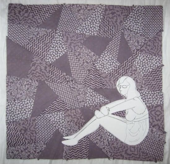
A couple months ago I pieced a few small quilt tops, only about 18" square. I began with 6 white-on-white prints, divided the prints in thirds, then dyed 1/3 a mid tone and 1/3 a dark tone to create, with the white, a transitionary trio. I enjoyed the way that the printed pattern came out or hid more depending on the dyed background cloth, and the way the patterns persisted in their small pieces no matter how I changed the Controlled Chaos pattern. I decided to use an identical self portrait image on all 3, to echo the repeating quality of the patterns. Today I narrowed down my images to 2 choices, slightly different in size, proportion, and shape. I pinned some mocked up paper patterns to the darkest of the quilt tops to get an idea for how the shapes might fit on the cloth.
Choice 1!

Choice 2!

The thread with which I will embroider these images will allow them to fade into the quilt top far more than suggested by the white paper, but for now it's still a useful aid.
I feel as though Choice 1 is perhaps a cleaner image, easier to understand, when subtle, without closely paid attention. I'm not crazy about how it fits on the quilt top, though. I much prefer the way Choice 2 fits, the larger difference between height and width in the character, the way it relates to the shape of the background. I like the way the shorter character allows the quilted patterns to dominate the overall image.
Hopefully I won't stare at these pictures too long before making a decision. Feedback welcome.
A couple months ago I pieced a few small quilt tops, only about 18" square. I began with 6 white-on-white prints, divided the prints in thirds, then dyed 1/3 a mid tone and 1/3 a dark tone to create, with the white, a transitionary trio. I enjoyed the way that the printed pattern came out or hid more depending on the dyed background cloth, and the way the patterns persisted in their small pieces no matter how I changed the Controlled Chaos pattern. I decided to use an identical self portrait image on all 3, to echo the repeating quality of the patterns. Today I narrowed down my images to 2 choices, slightly different in size, proportion, and shape. I pinned some mocked up paper patterns to the darkest of the quilt tops to get an idea for how the shapes might fit on the cloth.
Choice 1!
Choice 2!
The thread with which I will embroider these images will allow them to fade into the quilt top far more than suggested by the white paper, but for now it's still a useful aid.
I feel as though Choice 1 is perhaps a cleaner image, easier to understand, when subtle, without closely paid attention. I'm not crazy about how it fits on the quilt top, though. I much prefer the way Choice 2 fits, the larger difference between height and width in the character, the way it relates to the shape of the background. I like the way the shorter character allows the quilted patterns to dominate the overall image.
Hopefully I won't stare at these pictures too long before making a decision. Feedback welcome.
Subscribe to:
Posts (Atom)