Friday, December 18, 2009

Trio update

All three pieced tops are now embroidered, and ready for quilting. See?


But before quilting must come basting. I always sigh at basting; I'd rather get right to work. It really is necessary for this sort of thing, though. Plus, when you need to draw a line that is sure to leave no mark as soon as you're done with it, nothing beats a thin piece of thread.


While I'm showing you pictures, take a peek at these pages from my work book (sketch book? idea book?). This is the basic planning I began with, the careful plotting out of the pieced tops. Pre-planning is helpful.

Friday, December 11, 2009

Mid-December quilting

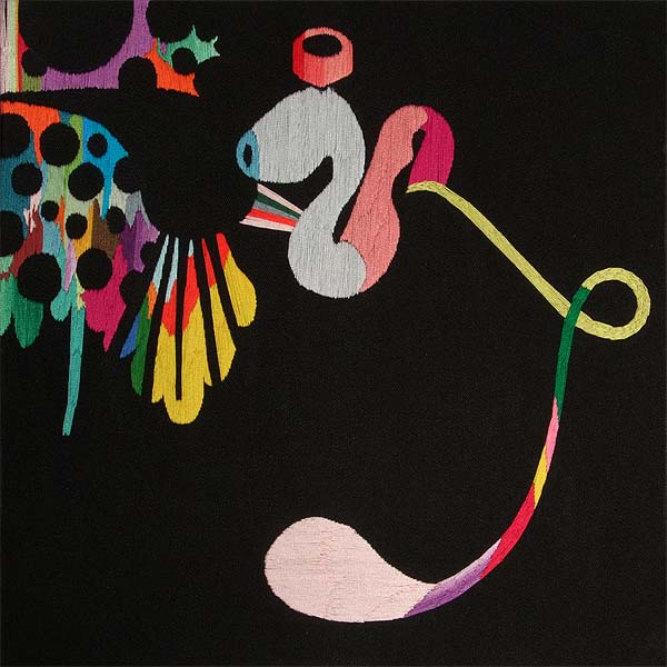
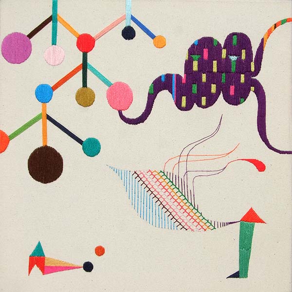
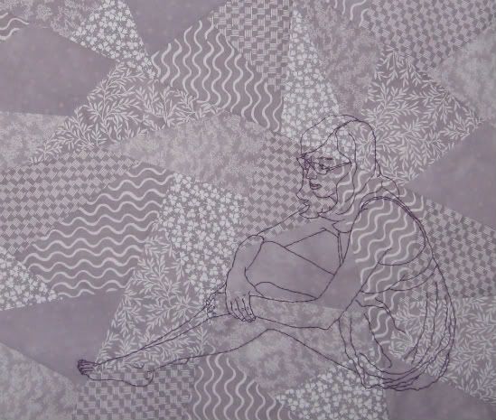
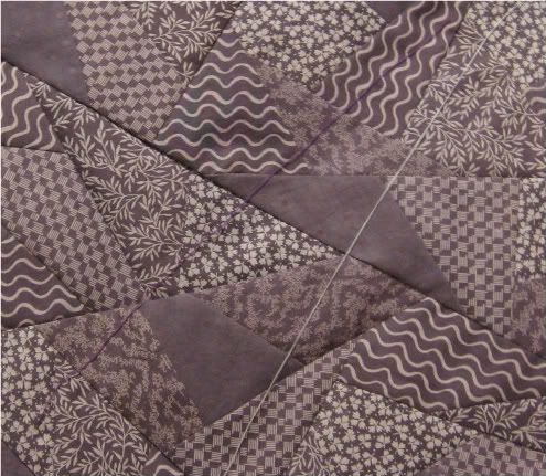
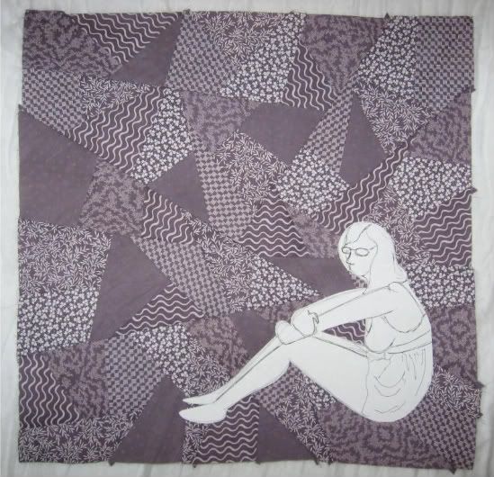
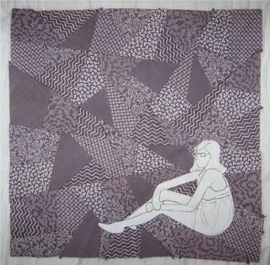
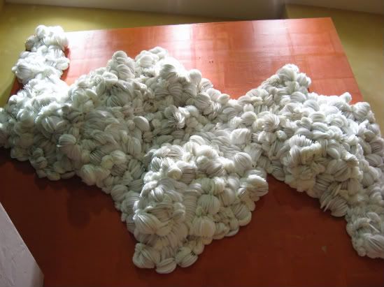
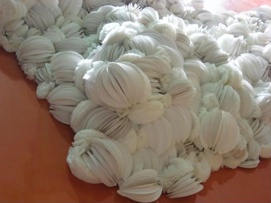
I've been hoping for a nice, clear skied afternoon on which to photograph the recently completed doodle piece (otherwise yet unnamed) but alas, it is southern California's brief rainy season, and photography-friendly conditions have been elusive. So until that changes, check out something about the piece that I am enjoying:


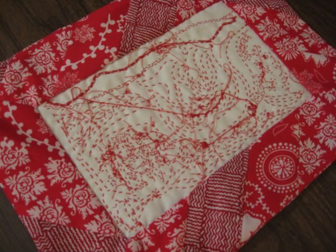
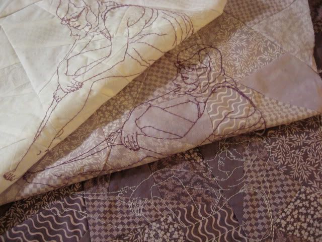
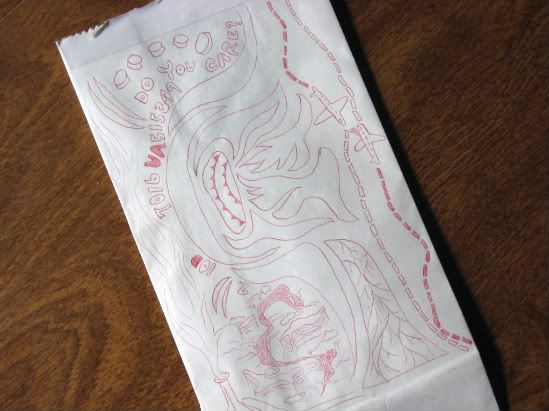
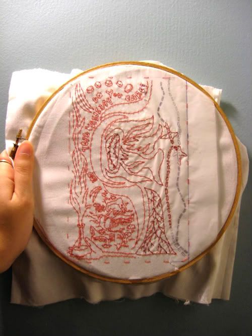
This is the back of the piece. It is as carefully bordered and presented as the front is.
I've always been intrigued by the backs of embroideries, the unexpected imagery that develops through the path of the stitcher's hand, the contrast between the intended image and the secret, hidden one. I'm often tempted to display work backwards, but always choose not to- I don't want to sacrifice the intended imagery for the unintended.
This time I decided to give both sides their due, so that the piece can be displayed as a finished work from either direction. Front and back have differently pieced borders in the same fabrics, related but different, just as the front and back of the image is.
It's an experiment, one I'm rather enjoying right now. I think it's fitting, as well- after all, the entire thing is an experiment.

In other news, here's something fun:


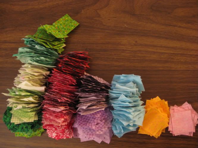
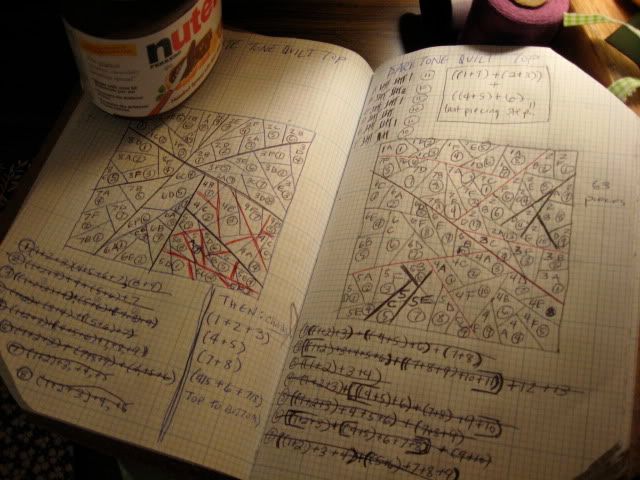
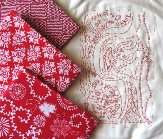
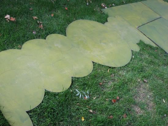
These are the first 1,000 pieces of what will eventually be a 3,969 piece quilt top. I've been wanting to tackle a full-sized quilt for some time now, but was putting it off because I simply didn't have fabrics I wanted to work with in the quantity needed for a really well-matched quilt. My hands and mind have been anxious for this sort of project, though- something long term, something full of order and repetition, something soothing- so I decided to go for it anyway. I picked a double nine patch pattern (like the one below) and plan to break up the intended large-scale pattern to create my own variation.


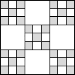
The neat part about this design, for me, is how it doesn't require (at least for about 54% of it) carefully matched fabrics. In the tradition of truly purposeful patchwork, the double nine patch gives me the chance to go through my stores of fabric, picking out even the smallest bits and finding use for them. If I can squeeze even one 1 1/2" square out of a scrap, it is useful.
Of course, by now I've gone through all of my basic pattered cottons, and have barely a quarter of the squares I need! That's another nice thing about this project, though- it lends itself to mismatching, so if some parts are composed of the materials I have now and others from scraps of future projects, that's ok. It's nicely frugal. It makes me happy.

Tuesday, December 1, 2009

Takashi Iwasaki

While I work on the final stitches of the doodle piece, take a look at this artist:

Nyokinyokinijiirokousen
Embroidery floss and canvas (hand embroidered)
40.5 x 40.5cm
2008


Sakuretsupipe
Embroidery floss and fabric (hand embroidered)
30.5cm x 30.5cm
2008


Fishbonbon
Embroidery floss and fabric (hand embroidered)
28.5cm x 28.5cm
2008


The artist I am referring to is Takashi Iwasaki. Iwasaki's work is not limited to embroidery; on his site you can see many interesting paintings, drawings, prints and collages. For now, though, I want to give attention to his embroideries.

In a way, Iwasaki's work and my own have some similarities. We share a medium, and a concern for shape and space. However, it is the differences that really capture my attention. My work tends to be quiet- his sings out at high volume. Iwasaki's embroideries focus on color, pattern, shape, line, and space in a bright, bold way. Rather than drawing a clear narrative with his threads, he uses his shapes and colors to suggest images, playing with your eyes in a delightful way. It's exciting to see how the the same broad medium I work in can be used to such a striking and different effect.

But! I ought to be stitching. Go check out his site- it's really worthwhile.

Saturday, November 14, 2009

Press, prints and patterns

Some brief updates:

The show I worked on a few weeks ago has been getting some press at FresnoBeehive.com, and the set has gotten some mention. Quotes:
"There are many aspects of this version of "All in the Timing" that are effective, from Jeff White and Chris Campbell's inspired set design (distinguished by Katharine Lawrie's artwork) to the sight of the very amusing Red blundering around stage with a mountain climber's axe buried in his skull."

"Tell us about the set. I understand it's pretty wild."
"The set, designed by Jeff White, built by the cast and crew and painted by Los Angeles artist Katharine Lawrie, has four separate playing spaces to allow quick shifts between the plays and help provide a variety of looks. The set theme is a fanciful play on the title and all the vertical surfaces are covered with 344 unique 'clocks.'"
I must say, it's kinda fun to see myself referred to in print as a "Los Angeles artist."

In other news! I selected some prints with which to piece a border for my doodle embroidery:


Reds and whites with interesting shapes and linework, to echo and compliment the doodlework.

While looking for those prints, I stumbled upon a Veterans Day pattern sale where I snagged 100$ worth of patterns for a mere 6$. I rarely buy patterns, figuring that I know how to drape and draft and can make them myself- but at only a buck a piece, I couldn't pass up the time saver. I chose all patterns that I thought could not only give me an interesting garment or two on their own, but could then be altered in many ways, limited only by my imagination. I think I might play with the skirt first.


Something I find both fun and amusing about those Project Runway patterns: in each one is a "Croquis Kit." The Kit is a piece of paper intended to help one branch out from the basic pattern. It illustrates the pattern elements (bodice, skirt, sleeves, yoke, details, etc) one by one with all their offered variables, and encourages the stitcher to mix and match them in the manner of Fashion Plates to create their own, more unique design. Paired with the illustrations are quite a few example designs and instructive paragraphs with titles such as "A Word About Inspiration," "Workroom Tips," and "Design Tips." All of this makes me laugh at first, because after having done this sort of thing on my own for so many years, it seems so obvious- but then, I suppose, it's really actually pretty cool. How often do you buy a pattern that, instead of encouraging you to buy another pattern, encourages you to get creative and experiment with just one to create as many different garments as you can? Project Runway, I approve.

Tuesday, November 10, 2009

A thread color debate

Choice 2 won out!


Before I made a single stitch, I planned out which threads to use with which piece. The white piece would get a pale lavender, the pale lavender a darker purple (as seen above!) and the darker purple a white thread. This was my plan.

Now that I have begun, though, as it always goes, I am questioning my plan. Should I do as I planned, and use white thread to embroider the darkest piece? Or should I use the darker purple thread of the mid tone piece on all 3 pieces?


Or do I wait until Thursday afternoon, when I planned on going out for some quilting supplies anyway, and pick up a drastically darker purple thread, dark enough to stand out from the dark purple background? Each option comes with different implications.

The same color thread on all 3 pieces will ensure that the character is affected differently by the pattern in each piece. As the fabric grows darker and the patterns more apparent, the character will grow more overwhelmed- which is a good thing, congruent with the concept. However! Will the character be so overwhelmed on the darkest piece as to be hardly noticeable? Would I be ok with that, if it is the case? Conceptually, this is my strongest option- but is it the strongest visual one? *EDIT- This option isn't an option. While it is my favorite one, the thread I have already used on the mid tone piece just isn't visible on the dark piece. As much as it supports the concept, well, it supports it a little too strongly. I want the character to be overwhelmed by the patterns, not made invisible by them. Oh well.*

Using white on the darkest piece echoes the connective cycle I have planned for the final quilting- each piece receiving a treatment reminiscent of the piece prior. It connects 1 (the lightest) to 2 (the mid tone), 2 to 3 (the dark tone), and 3 to 1. This was my original plan, and remains my quilting plan. Conceptually, not as strong, but stronger than the next choice. Visually more apparent than the former choice, but will it be more apparent than the next?

Using a very dark purple on the darkest piece connects the 3 pieces in a different way, by applying a tonally darker thread to each piece. I feel that this is the weakest connection- but it could be the most visually pleasing.

I'm currently stuck. Opinions welcome!

Friday, November 6, 2009

Mocked up images

This past year I've begun to really enjoy quilting. To be more precise, I enjoy piecing. The actual quilting together of layers I'm not yet so keen on, but I do really love the piecing. One type of quilt that has especially caught my attention is the Crazy Quilt, in which there is no discernible repeating, organized pattern, but rather improvised whimsy. I've been bringing this idea of the crazy quilt into some of my recent pieces. I have found, however, that the improvisational quality doesn't work with my tendency for pre-planning my pieces. As such, when approaching this look, I am making not quite what you could call Crazy Quilts, but more Controlled Chaos Quilts. I plan out the entire piece first on paper, which I then cut into pieces that can be puzzled back together when recut in fabric. That's a process explanation for another day, though. Today is about imagery.

A couple months ago I pieced a few small quilt tops, only about 18" square. I began with 6 white-on-white prints, divided the prints in thirds, then dyed 1/3 a mid tone and 1/3 a dark tone to create, with the white, a transitionary trio. I enjoyed the way that the printed pattern came out or hid more depending on the dyed background cloth, and the way the patterns persisted in their small pieces no matter how I changed the Controlled Chaos pattern. I decided to use an identical self portrait image on all 3, to echo the repeating quality of the patterns. Today I narrowed down my images to 2 choices, slightly different in size, proportion, and shape. I pinned some mocked up paper patterns to the darkest of the quilt tops to get an idea for how the shapes might fit on the cloth.

Choice 1!


Choice 2!


The thread with which I will embroider these images will allow them to fade into the quilt top far more than suggested by the white paper, but for now it's still a useful aid.

I feel as though Choice 1 is perhaps a cleaner image, easier to understand, when subtle, without closely paid attention. I'm not crazy about how it fits on the quilt top, though. I much prefer the way Choice 2 fits, the larger difference between height and width in the character, the way it relates to the shape of the background. I like the way the shorter character allows the quilted patterns to dominate the overall image.

Hopefully I won't stare at these pictures too long before making a decision. Feedback welcome.

Thursday, November 5, 2009

Paper surprise at the Grove

Last night a friend and I went out to the farmers market for dinner to celebrate my one year anniversary of being back in LA. After we ate, we moseyed around the Grove, a big ol' outdoor shopping center attached to the old market. She suggested we do some window shopping in Anthropologie. As soon as I walked in, it was not twee cardigans, sweet dresses or faux-vintage heels that caught my eye- it was the art installation high up on the wall. See:


Immediately I walked closer, wondering what that soft bulbous material was. As soon as I was close enough, I laughed.


Look at that. Paper plates and coffee filters. I swear, these materials are fiber art staples. I love when they surprise me with their presence. It's so nice to see a constructed surface installation like this quietly dominating a major commercial space.

I haven't been able to find out online who did this piece; it didn't occur to me to ask at the time. If you've any leads, let me know. If you're in LA, stop by and check it out!

Wednesday, November 4, 2009

Doodletastic

As I've mentioned before, most of my work is based on photographic imagery. Primarily, this has been an issue of practicality- I've sought a level of realistic accuracy in my imagery that is well obtained through photographs. I've also used photography as a way to balance the labor intensiveness of the stitchery with a less labor intensive means of obtaining images. A small part of it, however, has been a lack of confidence in anything drawn by my own hand, a question of the worth of such images.

Then, a few weeks ago, I was on a long plane ride. I was bored, and groggy from Dramamine. My thoughts were rambling. There was an airsick bag in the backseat pocket and a pen in my bag. Under these circumstances, this happened:


I was intrigued by the image I had doodled, and after looking at it from my little window seat for several hours, I tucked the paper bag in my luggage and took it with me. It sat on the side table by my bed during my trip, and I caught myself considering it daily. When I went home, it traveled to my studio table. There it sat, catching my attention, until I found some print cloth, red thread and the desired embroidery hoop. This is what has come from that:


Here is that doodle as an embroidery in progress. On the right is the unstitched pattern; in the middle is the pattern covered with stitches; on the left is the finished area with the pattern paper torn away.

This piece is exciting to me, as it's the first one in which I've really relied only on my hand and imagination for the subject matter. I don't plan to abandon my use of photography as a main method of making images (especially as I have a few pieces like that in progress!) but it is rather neat to peek into this realm of possibility. That excites me.

Tuesday, November 3, 2009

Unfinished Clockwork

Thanks to the glories of the internet, I have stumbled upon some progress shots of the clock set! The photographer's focus was the actors and not what stood behind them, but there is still some set documentation to be found. When this photo was taken, the clocks were at a midpoint - faces painted, but without the details of borders, hands, numbers and other symbols that were to come.


The actual clock-face painting process was an unexpected breeze. As I mixed the four yellow tones, a helper showed up with friends in tow! Friends! In tow! There was a person to go with each can of paint, and I was thrilled by how quickly we managed to get every single circle covered in a new tone. After only 6-7 hours, we had completed this step for the entire set, a pace that blew my dreams away.

Now then. In this particular scene, the lighting was designed to be a more cheerful yellow than at any other point, so the colors are a bit warmer than they really were, but look- behind the actors- you can see the variety of clock sizes, the 4 yellow tones, the greenish background. Now imagine about 13 times as many clocks as you can see here (a conservative estimate) and you'll perhaps begin to imagine what was happening on my drop cloth.

Unfortunately, I had to leave town before getting any shots of the finished set, but I'm hopeful that some will surface before the show's 5-week run is through. I may have to send a friend on a photo-expedition.

Thanks to A.R.T. in Fresno for the image.

Monday, November 2, 2009

Circles upon circles

The first step of painting the set I recently worked on was finding and buying the pieces to paint. We dragged flats (thin faux-walls) out of storage and purchased sheets of luaun (a thin, pressed wood material) from the hardware store. Then came the actual painting part. We (myself and a friendly young man) painted everything black, to make sure that the final paints would have the same effect on both the new and used materials. Next came a very thin layer of watery gold ("Gold Shag," to be accurate) paint to soften the eventual contrast between the yellows that would come and their background.


See these? Except for ohh, one of the visible pieces seen here, all of these would end up covered in clocks. The pieces leaning on the railing at front, the pieces laying on the lawn, the pieces stacked against the stairs in the back of the photo. Not pictured: the pieces leaning against the wall to the right.

Once everything was not-black, I could begin the actual drawing process. I cut lengths of cord to mark the radius of circles 8", 12", 16", 20", 25", 30", and 35" in diameter and twirled those around pins as makeshift compasses to draw the hundreds of circles that took over my next three days.


This is the center-most piece, which sat above a projection screen at the center of the stage. It's a little difficult to see, but there they are- thin pencil marks outlining the many many circles that would eventually become clocks. This center piece featured the lone 35" clock, the "clock tower" focal point in an overwhelming sea of clock.

It was a bit frustrating as the pieces went under stage lights on the last drawing day. The tech crew and actors needed to work with the set up, so before rehearsal the pieces were screwed into place for a few hours before coming down again. The moment the lights hit them all the pencil marks seemed to disappear, taking every hour of my work with them, along with the justification for my sore fingertips, achey back and bruised knees, until the set was dismantled again. After that, the next day's painting was a relief- but that's when my camera batteries died! Further pictures thus far elude me, but I'll keep looking.

Wednesday, October 28, 2009

Clockeriffic

This past week, despite my having a project I am rather excited about, I have stepped away from my work. I'm instead working on a theatrical set for some friends with a local theater company. Their set was conceptually designed, but due to some complications in scheduling, they suddenly found themselves without anyone confidently artistic to oversee and execute the physical, actual design of it, so I traveled up to help.

The show is a set of short one acts brought together by a common theme of time. Thus, the set shares the theme, and is dominated by endless clocks. About 324 square feet of clocks, actually. Perhaps a little more. These clocks are to decorate the back walls across the stage and the front of the two platforms much action takes place on. They are meant to be metallic-ish, gear-like suggestions of clocks more than actual clocks- no one in the audience should be able to look past the actors and go "hm, it's 3:25 and 7:42 and 12:16!"

What all this means is that my head is chock full of circles these days. When I close my eyes I see this:
OOOOOOOOOOOOOOOOOOOOOOOOOOOOOOOOOOOOOOOOOOOOOOOOOOOOOO

It took one day to paint all of the set materials black as a beginning. The next day and a half or so was spent coating them with a very thin layer of watered down gold paint to soften the black background into one that eventually appeared greenish. It took about three days to draw all of the circles, which range in size from 8" in diameter to 35", with about 6 variations in between. Today I mixed four shades of golden yellows and, with a crew of 3, painted the faces of hundreds of will-be clocks. Tomorrow I'll begin free hand detail work in darkened versions of the paints used today. Here's a handful of the images I'm currently looking at, to gear my mind up for the work tomorrow:


I'll try to get some pictures before the show opens and I leave!

Saturday, October 24, 2009

A frequently used process

Much of my work involves embroidered imagery drawn from photography. I thought I'd begin here with a little tour through a process I often use to turn a photograph into an embroidery pattern, using an older piece as a model.

To begin, I select an image in which the subject is clearly visible, such as this one:


I scan the image, resize as needed, adjust brightness and contrast, and print it out in black and white, like so:


Next I draw over the image, picking out lines and shapes I want to end up in the eventual embroidery pattern:


Once the line drawing is complete, I retrace the image on to the tracing paper I use as my pattern:


And so goes the process:


With the pattern ready, I can adhere it to my chosen cloth and stitch away, perforating the paper with my stitches so that it is easily removed when I am done. This is the finished embroidery of that piece:


It's a bit of a time consuming and labor intensive way to go about turning the image into the pattern, but then, most of my work is time consuming and labor intensive, and I rather enjoy it. I'm a time consuming/labor intensive appreciative kind of girl.

(The entire piece can be seen here!)

Thursday, October 22, 2009

Introduction

Back in art school, I was surrounded by people willing and eager to see my progress and offer feedback.
Now, graduated and 3,000 miles away from my former studios, a responsive audience is much harder to capture. This blog will serve as a tool in that search.
Here you will find contemplations of ideas, progress shots and explanations, glimpses of finished products and links to inspirations. It's a door into my studio, accessible from any distance.
Come on in.